About this Nest

30 ish SoCal girl. Living with her adorable Hubs. Blogging about her - loving, cooking, baking, eating and going to interior design school. Is there something you want to know? Just ask :)
Blogging Friends
In the attic
- May (3)
- June (1)
- April (2)
- January (1)
- December (8)
- November (10)
- October (17)
- September (41)
- August (7)
- July (2)
- June (4)
- May (7)
- April (10)
- March (9)
- February (9)
- January (9)
- December (27)
- November (31)
- October (12)
- September (16)
- August (9)
- July (9)
- June (10)
- May (12)
- April (18)
- March (11)
- February (12)
- January (28)
- December (33)
- November (29)
- October (22)
- September (17)
- July (1)
November 18, 2011
Five for Friday
1 - You won't go get food trucks for lunch without me.
2 - You went to Fred's with me last night to get tasty Mexican food.
3 - You like when I the subjects of our daily email treads are words spelled in creative ways. (Example: FryDay)
4 - You got two songs suck in my head this morning.
5 - You have very little knowledge of Pop Culture and you get really excited when you know something.
November 16, 2011
Interior Design Bingo – Door, An Item Repurposed, Up Lighting, and Scale
I came across this door today, linked through Twitter to House of Turquoise. This door is gorgeous and unlike anything I’ve seen before. If I could change my front door (and this would match our house) I’d be calling a contractor right now.

I love clever items, I think I’d told you this before. This is a light fixture found at The Dry Bar in Fashion Island, although I’m pretty sure they have at least one of these in all their salons. I think it would be super cute in a teenage girl’s bathroom or above a vanity.

The infamous up lighting. This square on the Bingo board has been the most difficult to address. Heck, I tried to find pictures online to define it and had little luck. You can imagine how excited I was to see these lights flanking the elevator at my Dr’s office today. Hideous 90’s mauve tile be damned, I was posting these lights!

These lights at the JW Marriott Desert Springs Resort & Spa (aka the hotel Jessie, from Saved by the Bell’s, Dad was married) are one of my favorite examples of scale. This space is HUGE and those lights are equally huge. This may sound silly but when I first walked into this space and saw those lights I froze. See, I love ceiling and lighting design and I loved this solution. There was no drop down ceiling or hanging ceiling clouds, they kept the open and grand feel of the space. I just love it.
Have you checked out the posts by the other participants?
November 11, 2011
Five for Friday
1 - You're kicking butt on your business trip this week, even though you had to go alone.
2 - You managed to find a Chinese buffet in Georgia. It's funny you ate Chinese food the same night I made myself Mexican food.
3 - You're already planning on where we'll eat when I pick you up from the airport on Sunday.
4 - You make me laugh, even from the other side of the country.
5 - You look hot in a sweater ;-)
Interior Design Bingo – Outdoor Seating, Art & a Bathroom
I’m so behind on my own challenge, it’s pretty embarrassing. My excuse is I’ve been under the weather most the week and really didn’t have the energy to write blogs posts… along with the 10 page paper I had due on Wednesday. The good news? A) I’m feeling better, I was able to eat solid food yesterday, TMI? B) The class with the paper met for the LAST TIME on Wednesday! I just have to finish my internship hours and I can check that class off the list! YAY! Okay, on to the Bingo…
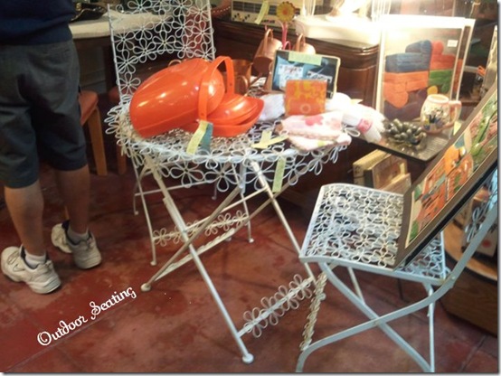
Outdoor Seating

On our way up to LA on Saturday, to celebrate the beautiful Kinzie Says' birthday, Hubs and I stopped in Long Beach where there is a block or 2 of retro and antique stores. We found SO MANY things we need want need for the new house. (P.S. I should probably stop talking about this house because I kinda jinxed it posting about it last week). We were talking around the last antique shop when I spotted this outdoor cafe set. It’s way girlier than most things I’m drawn to, but there are daisies all over it (as you can see) and I am a bit obsessed with daisies. Since we have absolutely no where to put it right now, I just took a picture and freaked the guy in the background out.
Art
At the same antique stop I spotted this birdie print at the cash register while they were ringing up Hubs’ finds. (We found some awesome barware!) I convinced myself I needed it and planned the whole guest room around it, I checked the price and realized it was $600. I don’t really have $600 to spend on bird are right now when we’re trying to buy a house. The saddest part is I can’t read the artist’s signature. Do you have any idea who did this?
Bathroom 
I chose this bathroom because it’s so different than anything I would think to design, but it’s so clever… and I LOVE clever design. Using the basket to hold towels? I LOVE IT! I love finding things like this, they totally inspire me to think outside the box or outside my comfort level.
Have you checked out the posts by the other participants?
November 4, 2011
Five for Friday
1 – You were so extremely excited when we got trick-or-treaters. Even if there were only 3 of them and they came at the same time, you were so happy.
2 – Our jack-o-lanterns.

3 – You give the best hugs.
4 – You tell me when the scary scenes of American Horror Story are over so I can lower my pillow. That thing in the basement freaks me out!
5 – You’re on board with painting our cabinets aqua.
The End of October Photo Challenge

Day 28 of the October Photo Challenge was flowers.
My bestie, Felicia, gave me this super cute and colorful purse for my birthday. She said it looked like me because it was colorful and made from recycled plastic bags. She was right, I absolutely love it and I get a ton of compliments on it. It has the perfect amount of pockets so my stuff doesn’t get lost in my purse.
Day 29 of the October Photo Challenge was black & white.
This is the view from outside our apartment front door. We love our little pond and all the trees, which are a rarity in our area.
Day 30 of the October Photo Challenge was another self-portrait.
Here I am at work with my November calendar in the background. Good-bye October this challenge was fun.
November 3, 2011
Interior Design Bingo – Kitchen
…or the post in where a lot of you will probably think I’m crazy.
As I’ve talked about briefly in a couple Five for Friday posts, Hubs and I are in the process of purchasing our first home. It’s been quit a roller coaster so far, so haven’t posted any pictures or anything because I’m afraid to jinx it. Don’t worry, at some point I will blog about the whole process, show pictures, etc, I promise. But, today I’m just going to show you the kitchen.

The
So, why are we possibly crazy? This is our inspiration picture for the first phase of the kitchen remodel. The first phase is what we want to change about the kitchen before we move in.

Yes, we want to paint our cabinets aqua/teal/Tiffany blue. I love it! It’s so bright and cheery :) Eventually, we’ll replace the countertops (hopefully after I find a place that recycles granite countertops, because we do feel badly just throwing them away) and put a fun light in. (Don’t get me started on that ceiling fan in the dining area).

Have you checked out the posts by the other participants?
November 1, 2011
Interior Design Bingo Definitions
Mid Century Modern – A style of design that began after World War II and continued into the 1960s, that is marked by simplicity, clean lines, organic forms, and materials such as wood, metal, and plastic. Though color is used quite a bit in post-war design, mid-century modern is typically less cutesy than the more pop-art offerings of the later 1960s. (source) Think Mad Men.

Scale - The size of one object and how relates to another or to the space in which it is placed. For example in the pictures below: #1 the tables and sofas are all lower to the ground have the same slender scale; #2 is an example of a lamp on a whimsical scale but still fitting with the scale of the room; and #3 all the legs and structures of the multiple table are on the same scale.

Vignette – A grouping of accessories, photos, end table, and/or chairs.

Let me know if there are any more terms you want defined :)
Interior Design Bingo - Ceiling

This little ceiling accent was on the ceiling of Hubs’s and my room at the Tropicana in Las Vegas. The Tropicana had recently re-modeled their entire property when we took a vacation there in the Spring. I loved this detail they added to make the ceiling just a bit more interesting and it’s totally something you could add to any room in your home to make a plan ceiling a bit fancier.
Interior Design Bingo
It’s November 1st which mean it’s the start of Interior Design Bingo. I’m so excited several people signed up to play along.
ABC: Life from the start of the Alphabet

Bricolage

Forty Twenty Four

Heart the Day

Letters from the Heart

Love and Renovations

The So-Called Wife

Sugar and Spice


I can’t wait to see the inspiration these ladies post throughout the month. It isn’t too late to sign-up, just comment below and I’ll add you to the list.

Labels
- 30 Days in Sept (30)
- Allergies (2)
- Appetizers (1)
- Bedroom Design (1)
- Beef (1)
- Berries (3)
- Blog (57)
- Bread (4)
- Burgers (1)
- Cake Decorating (8)
- Causes (1)
- Charity (4)
- Chicken (1)
- Cookies (9)
- Cooking Light (17)
- Copy Cat (2)
- Corn (3)
- Cupcakes (4)
- Dairy Free (3)
- Design (3)
- Dessert (15)
- Diabetic (1)
- Dining Out (18)
- Discounts (1)
- Easy Peasy (11)
- Fail (2)
- Favorite Things (9)
- Five for Friday (112)
- Fonts (2)
- Food Trucks (6)
- Funny (2)
- Gifts (8)
- Giveaway (14)
- Gluten Free (30)
- Guest Post (3)
- He Cooks (2)
- Home Decor (32)
- Honeymoon (8)
- hummus (1)
- Inspiration (6)
- Interior Design Bingo (8)
- Life (16)
- Married Life (22)
- Misc (84)
- Movies (4)
- Music (1)
- NaBloPoMo (6)
- October Photo Challenge (12)
- Organic (2)
- Pasta (3)
- Pie (3)
- Product Review (4)
- Recipes (49)
- Reverb10 (19)
- Salad (3)
- Sea Turtles (1)
- Sheldon (3)
- Shoesday (3)
- Soup (2)
- Soy Free (3)
- Taco Tuesday (4)
- Trader Joe's Tuesdays (2)
- Tumblr (1)
- Vegetarian (14)
- Wedding (23)
- Weddingbee (13)
- WEVerb11 (6)
- Wine (2)
- WTF (1)
- Zucchini (3)


